Quick Start
This guide walks you through creating your first custom visualization using Muze Studio in ThoughtSpot. You'll learn how to search for data, select Muze Studio as your chart type, and customize your visualization using the code editor.
Step 1: Search for Data
- Open your ThoughtSpot cluster and navigate to the Search Data page.
- Select a data source from the available worksheets or tables.
- Click on the fields you want to visualize. For example:
- Select a dimension field like
ContainerorRegion - Select a measure field like
Average Unit PriceorSales
- Select a dimension field like
- Press Enter or click the Go button to execute your search.
ThoughtSpot displays a default visualization based on your selected fields.
Step 2: Select Muze Studio Chart
- In the chart type panel, click on Muze Studio.
A default bar chart appears, created using the Muze library. This chart visualizes your selected data with a simple configuration.
Step 3: Understanding the Default Chart
The default chart you see is a basic bar chart that:
- Displays your measure values on the Y-axis
- Shows your dimension values on the X-axis
- Uses the default color palette from your ThoughtSpot cluster
- Automatically adjusts to fit the container size
This chart is generated using just a few lines of Muze code, which you'll see and customize in the next step.
Step 4: Open the Code Editor
- In the upper-right corner of the chart preview pane, click the code editor button
</>. - The code editor panel opens with three tabs: HTML, CSS, and JS (JavaScript).
- The chart now displays on the left, allowing you to see changes in real-time.
The code editor gives you full control over your visualization through three components:
HTML Tab: Define the Chart Container
The HTML tab contains the structure for your chart:
<div id="chart"></div>
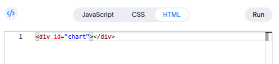
This <div> element is where Muze mounts your visualization. The id="chart" attribute is referenced in the JavaScript code to attach the chart.
Need to display multiple charts? Simply add more container elements with unique IDs:
<div id="chart1"></div>
<div id="chart2"></div>
CSS Tab: Style Your Visualization
The CSS tab lets you customize the appearance of your chart container:
#chart {
  width: 600px;
  height: 400px;
}
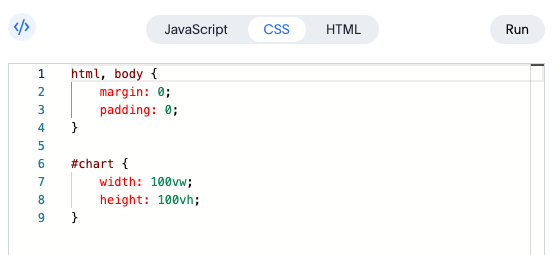
You can adjust the dimensions, add borders, padding, background colors, or any other CSS properties to match your design requirements.
You can also set chart dimensions using the Muze API with .width() and .height() methods in the JavaScript code.
JavaScript Tab: Create Your Visualization
The JavaScript tab is where you write the code to create and customize your chart using the Muze library.
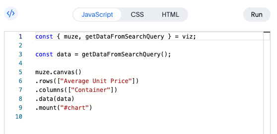
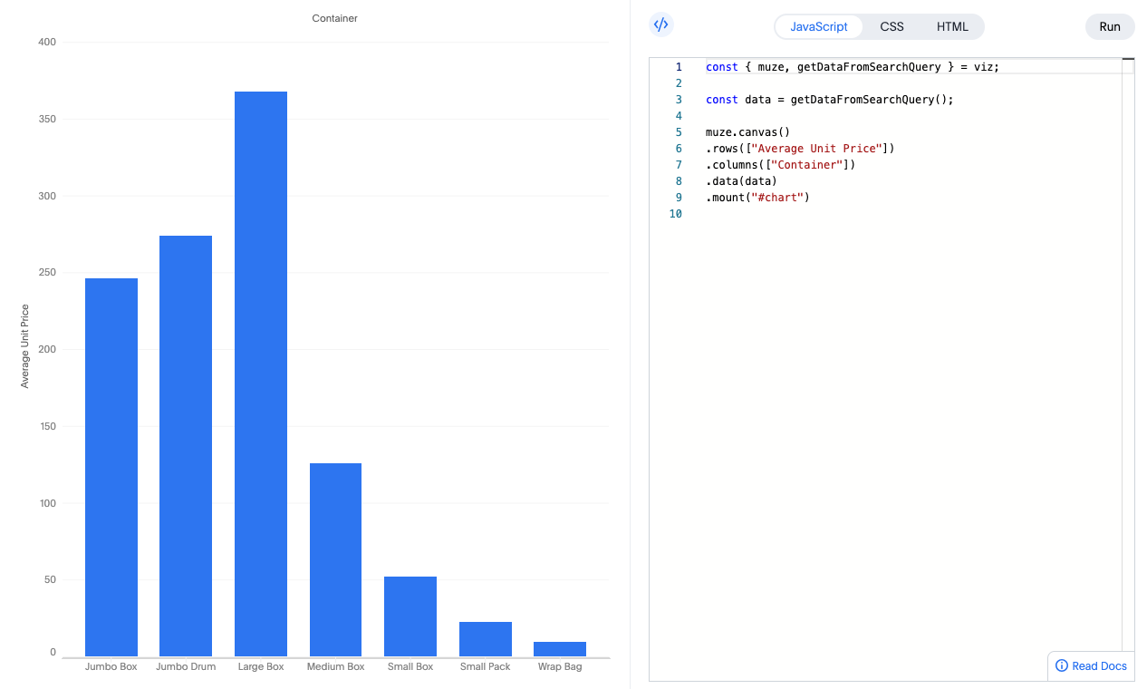
Step 5: Understanding the JavaScript Code
In the JavaScript tab, you'll see code similar to this:
const { muze, getDataFromSearchQuery } = viz;
const data = getDataFromSearchQuery();

muze
  .canvas()
  .data(data)
  .rows(["Average Unit Price"])
  .columns(["Container"])
  .mount("#chart");
Let's break down what each part does:
The viz Object
The viz object is provided by ThoughtSpot and gives you access to:
muze: The Muze visualization library instance with all its APIsgetDataFromSearchQuery(): A function that fetches data from your ThoughtSpot search as a DataModel instance
Getting Your Data
const data = getDataFromSearchQuery();
This retrieves the data from your search query as a DataModel. You can inspect this data in the browser console:
console.log(data.getData());
Here's an example of what the data might look like:
| Container | Region | Average Unit Price |
|---|---|---|
| Large Box | Central | 246.36 |
| Small Pack | West | 22.21 |
| Medium Box | West | 153.66 |
| ... | ... | ... |
| Large Box | South | 483.32 |
| Jumbo Drum | South | 250.81 |
| Small Pack | East | 23.47 |
Building the Visualization
Muze uses a chainable API to build visualizations declaratively:
muze
  .canvas()           // Create a canvas (container for your chart)
  .data(data)         // Attach the data from your search
  .rows(["Average Unit Price"])  // Define the Y-axis field (measure)
  .columns(["Container"])        // Define the X-axis field (dimension)
  .mount("#chart");   // Render the chart in the HTML element with id="chart"
Step 6: Customizing Your Chart
Now that you understand the default code, let's explore how to customize your visualization.
Change the Fields
Modify the rows and columns to display different fields:
muze
  .canvas()
  .data(data)
  .rows(["Sales"])
  .columns(["Region"])
  .mount("#chart");
Click the Run button to see your changes in the preview pane.
Add Faceting
Break down your chart by another dimension to create small multiples:
muze
  .canvas()
  .data(data)
  .rows(["Region", "Average Unit Price"])  // Add Region to rows
  .columns(["Container"])
  .mount("#chart");
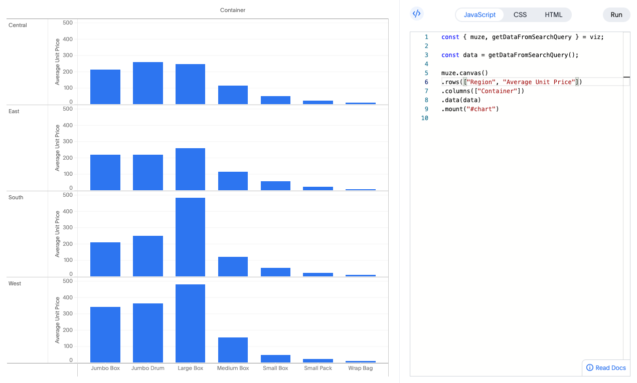
This creates separate charts for each region, all displayed together for easy comparison.
Set Custom Dimensions
You can control the chart size directly in the JavaScript:
muze
  .canvas()
  .data(data)
  .width(800)         // Set width in pixels
  .height(500)        // Set height in pixels
  .rows(["Average Unit Price"])
  .columns(["Container"])
  .mount("#chart");
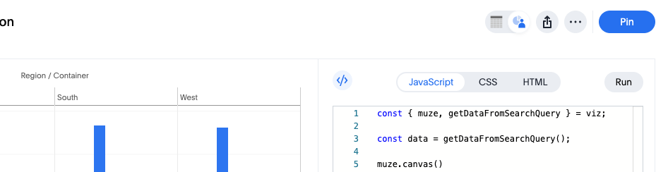
Step 7: Save Your Visualization
Once you're happy with your custom chart:
- Click the Run button to ensure your latest changes are applied.
- Click the Save button to save your Answer with the custom visualization.
- To share your chart on a Liveboard, click the Pin button and select the target Liveboard.
Your custom Muze Studio chart is now saved and can be accessed, shared, and reused by other users in your organization.
What's Next?
Now that you've created your first Muze Studio visualization, explore more advanced features:
-
Looking to manipulate your data before visualizing it? Check out our DataModel docs:
You can always come back here by clicking Read Docs again or visit our advanced guides. Enjoy exploring what Muze can do!